Japanese design applied to motion design → Connecting art to business
Design japonês aplicado ao motion design. → Conectando arte a negócios
BRAND → IDENTITY → ART DIRECTION
WHAT I DID:
→ Developing an artistically strong brand
Desenvolver uma marca artisticamente forte
→ Create striking visuals that connect with Japanese design inspirations
Criar visuais impactantes que conecte com as inspirações no design japones
→ Demonstrate the creators' breadth in motion design, illustration and mixed media
Demonstrar a extensão dos criadores no motion design, ilustração e mixed media

PROJECT OVERVIEW
EN | MIDORI is a studio composed of a duo of designers inspired by the art of the Japanese masters. As we observe the Japanese cultural movement and the way in which products are exported around the world, we understand that there is the possibility of a close relationship between brand and art. And this is how we work, creating an artistic movement for your brand that communicates with your audience. MIDORI is a project of mine with my partner and wife Luisa Spiri.
PT | A MIDORI é um estúdio composto por uma dupla de designers, inspirados pela arte dos mestres japoneses. Na maneira como observamos o movimento cultural japonês e o caminho em que os produtos são exportados para o mundo, entendemos que existe a possibilidade de um estreitamento entre marca e arte. E é assim que atuamos, criando para sua marca um movimento artístico que se comunique com seu público. A MIDORI é um projeto meu com a minha parceira e esposa Luisa Spiri.

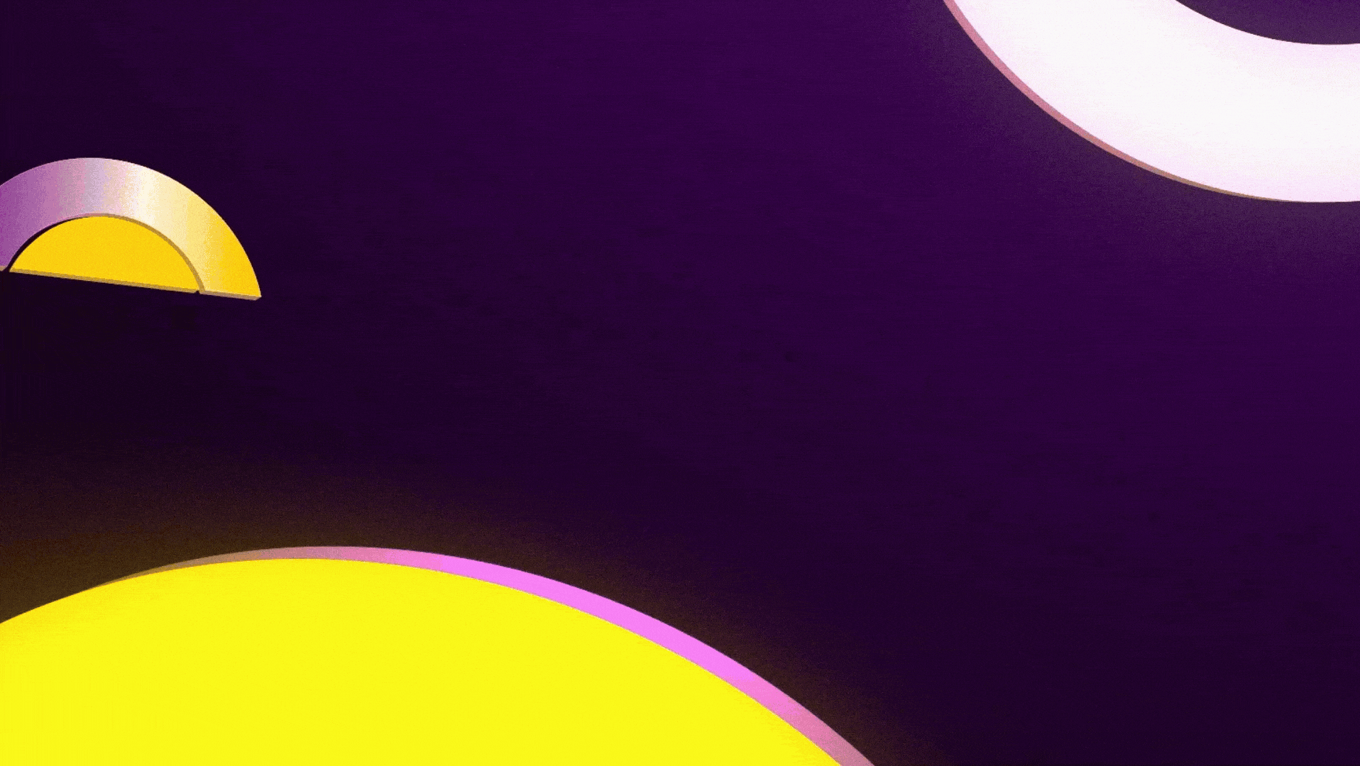
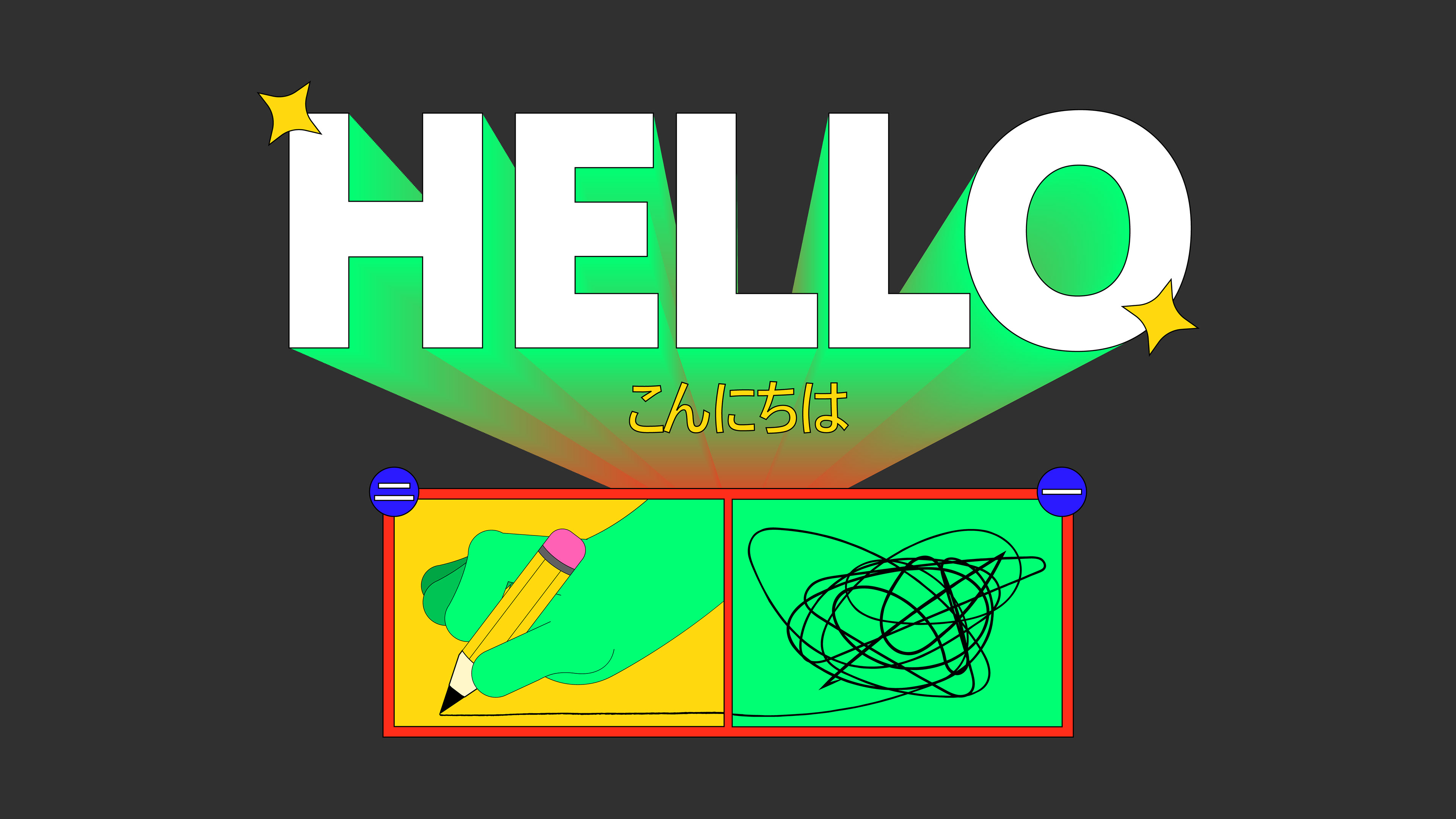
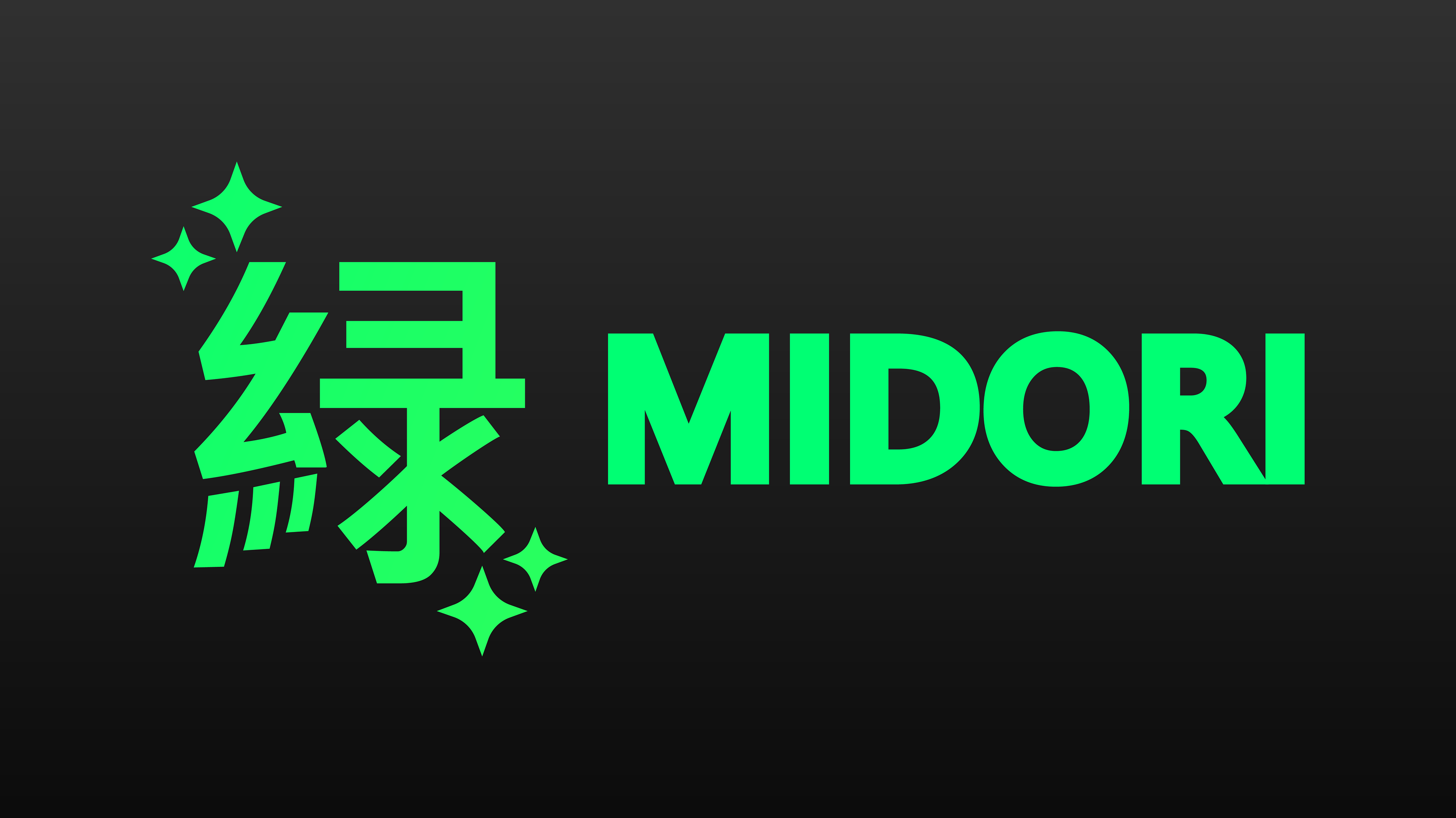
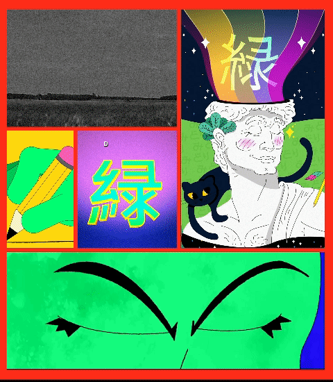
With all this psychedelic inspiration also comes the need to communicate in a simple way how the minds behind this studio work. Every idea we come up with, we try to bring freshness to the market, and so during the process of developing our brand the color green was screaming in our ears. And there it was, the answer to both our name and our symbol: MIDORI.
Com toda essa carga psicodélica que nos inspiramos vem também a necessidade de comunicar de maneira simples como funcionam as mentes por trás desse estúdio. Cada ideia que temos, procuramos trazer frescor para o mercado e com isso durante o processo de desenvolvimento do nosso brand a cor verde gritava em nossos ouvidos. E aí estava, a resposta tanto para o nosso nome quanto para o nosso símbolo: MIDORI.

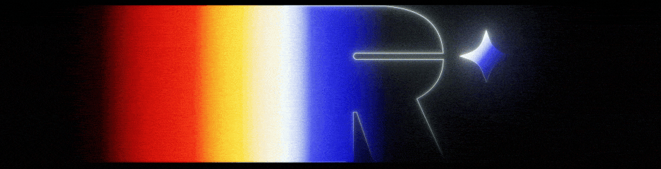
緑 - MIDORI - The word and Kanji we use to describe the color green. And so we developed our writing within the Japanese alphabet.
緑 - MIDORI - A palavra e o Kanji que utilizamos para descrever a cor verde. E assim desenvolvemos a nossa escrita dentro do alfabeto japonês.

Visual framework
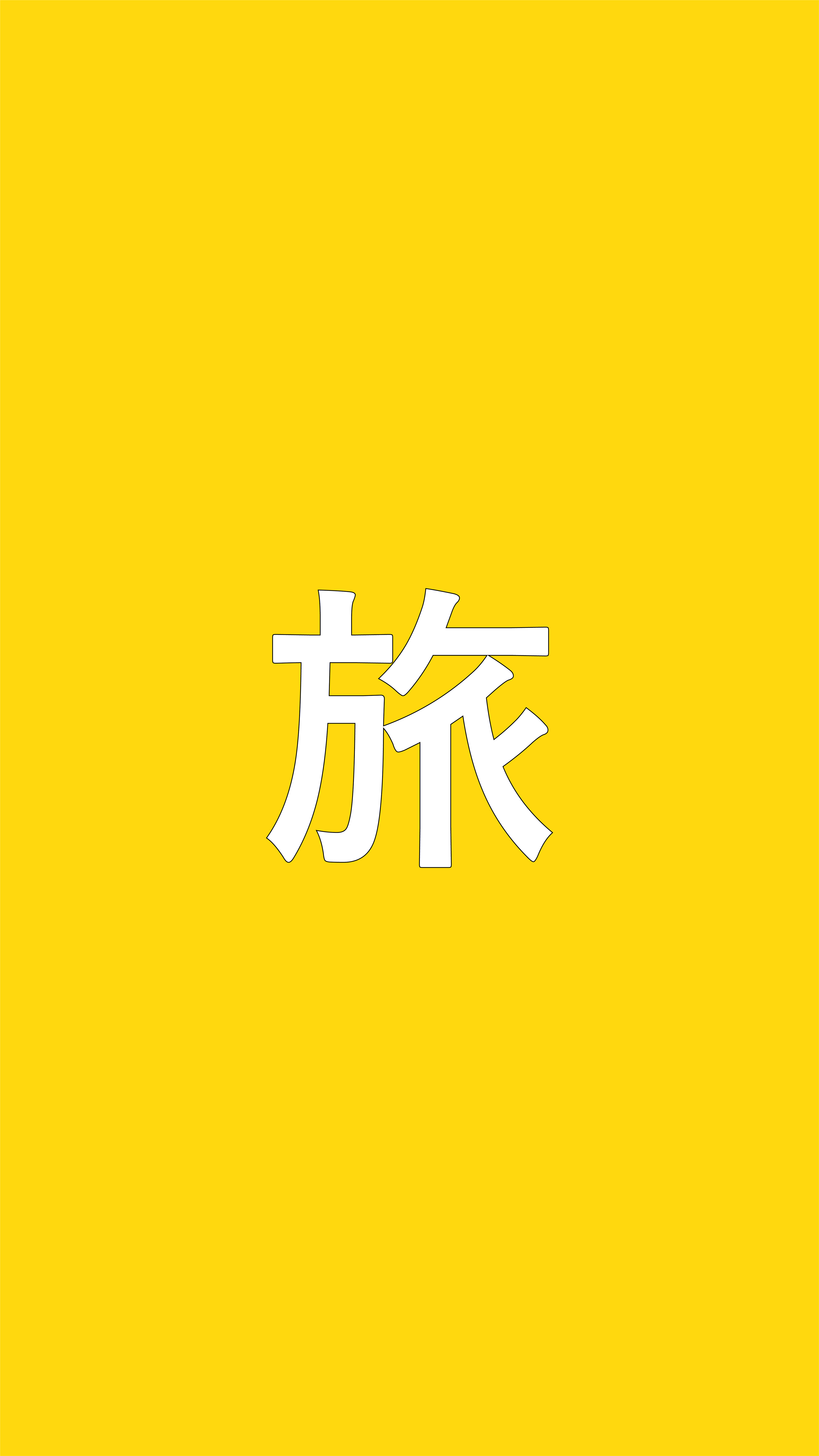

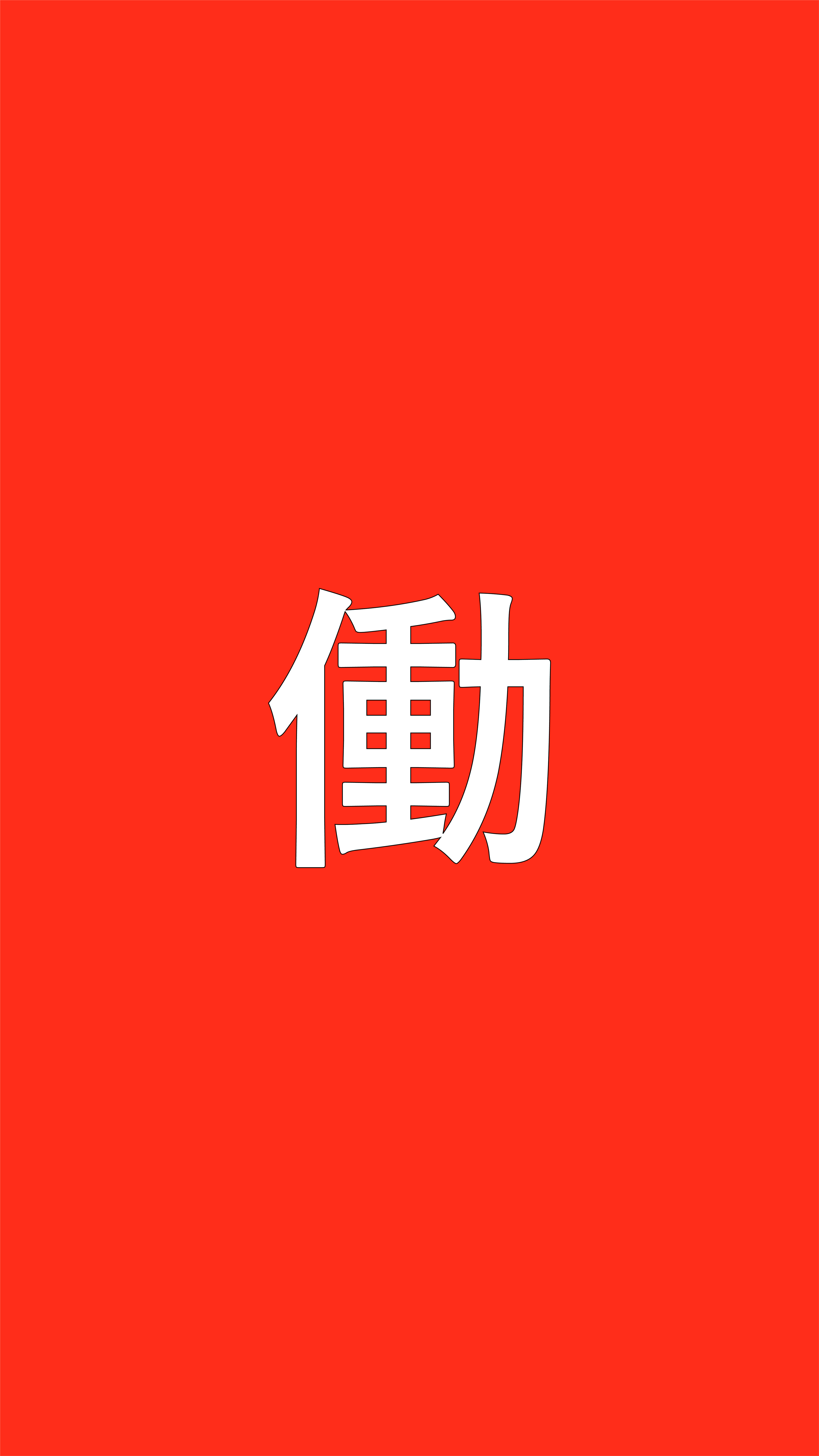
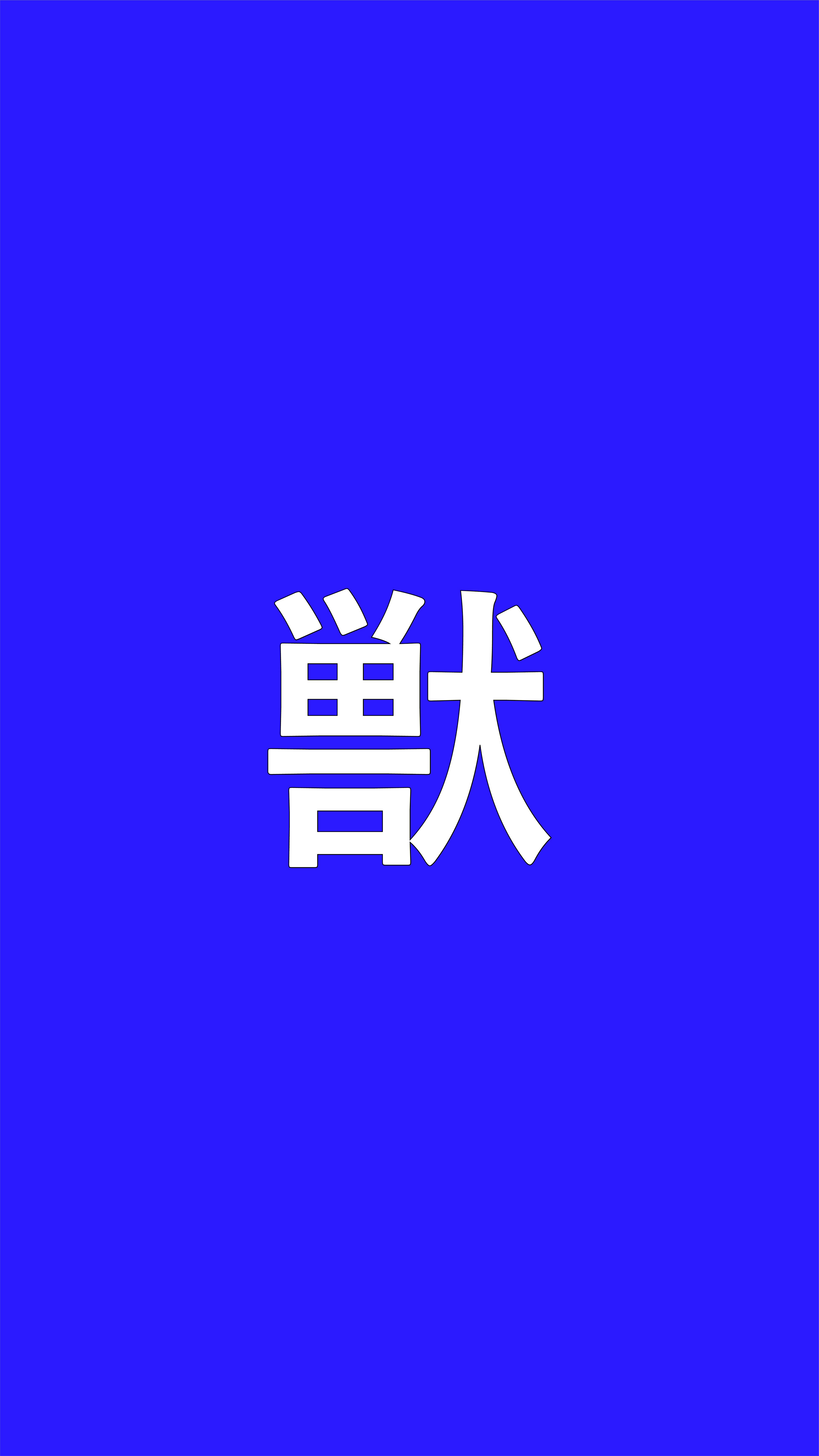
Journey - Harmony - Work - Beast

“MIDORI represents the freshness of our ideas, and the possibility of a new vision for Western visual design.” → Luisa Spiri
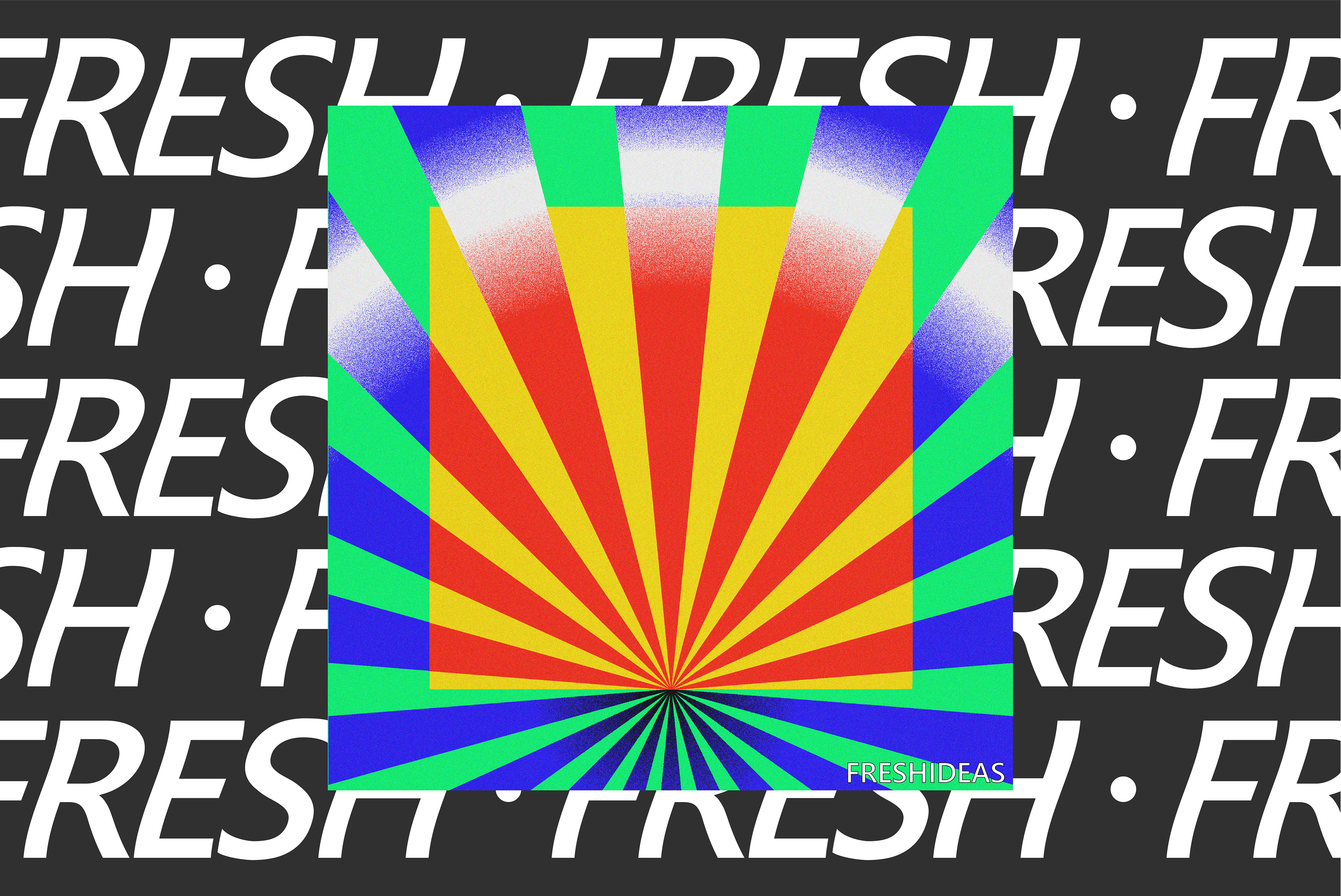
With the extensive experience of our team, MIDORI produces graphic pieces that break the pattern of an identity, always seeking to create striking visuals that make our clients stand out in the market.
Com a extensa experiência da nossa equipe, a MIDORI produz peças gráficas que quebram o padrão dentro de uma identidade, procurando sempre criar visuais marcantes e que destaque nossos clientes no mercado.

RESULTS:
→ With a defined studio brand we reach new clients
Com uma marca de estúdio definida alcançamos novos clientes
→ The brand expresses to our clients the type of motion we do
A marca expressa para nossos clientes o tipo de motion que fazemos
→ We create connections with advertising agencies and design studios
Criamos conexões com agências de publicidade e estúdios de design

ありがとうArigato