From small family business to state distributor → Quality beyond locality
De pequena empresa familiar a distribuidora estadual → Qualidade além da localidade
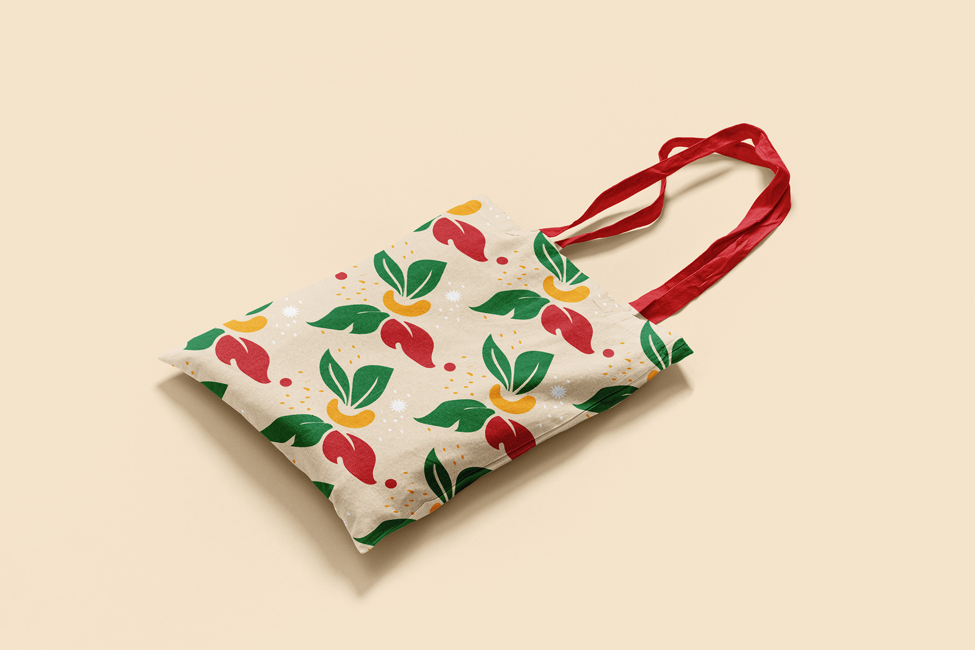
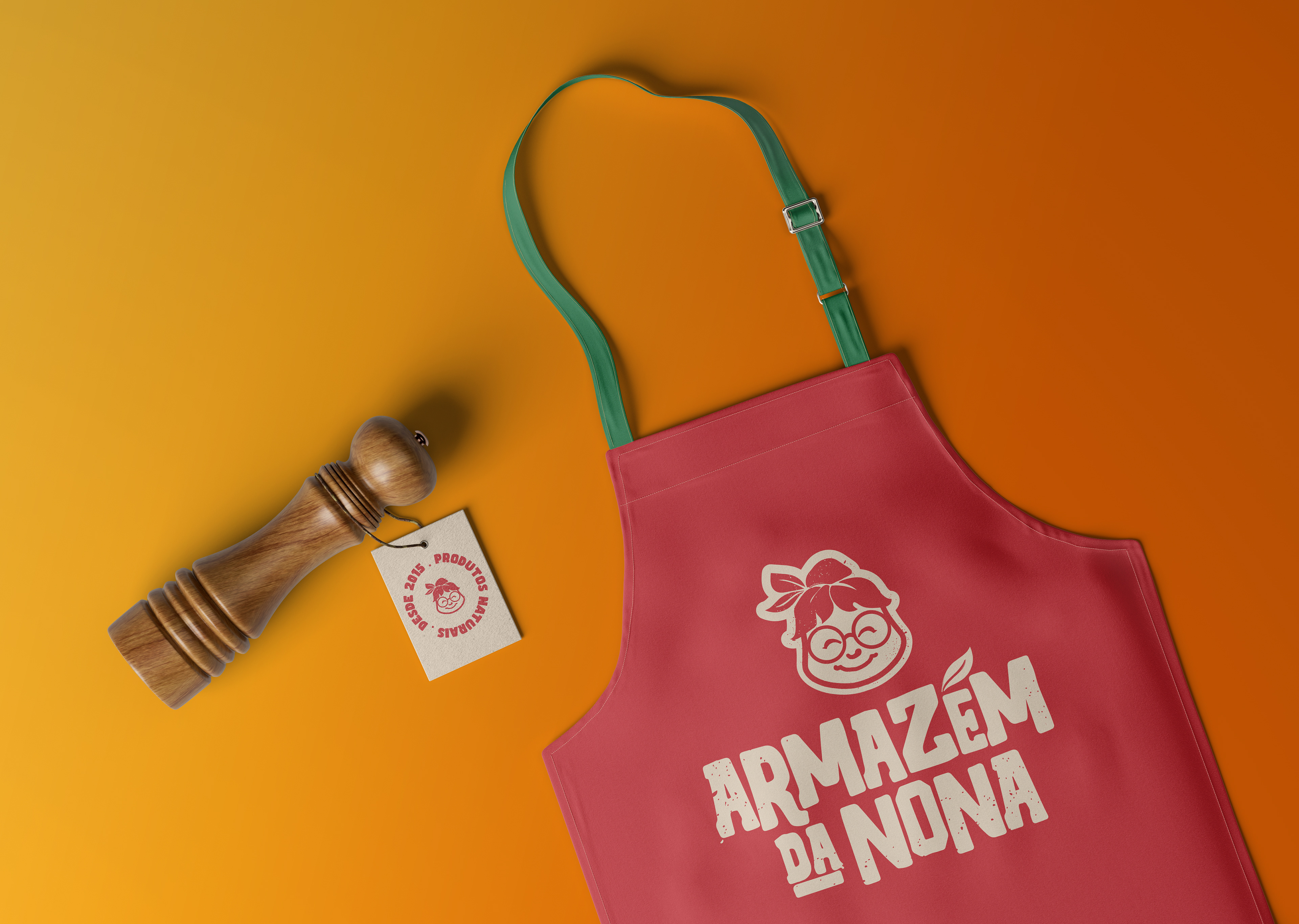
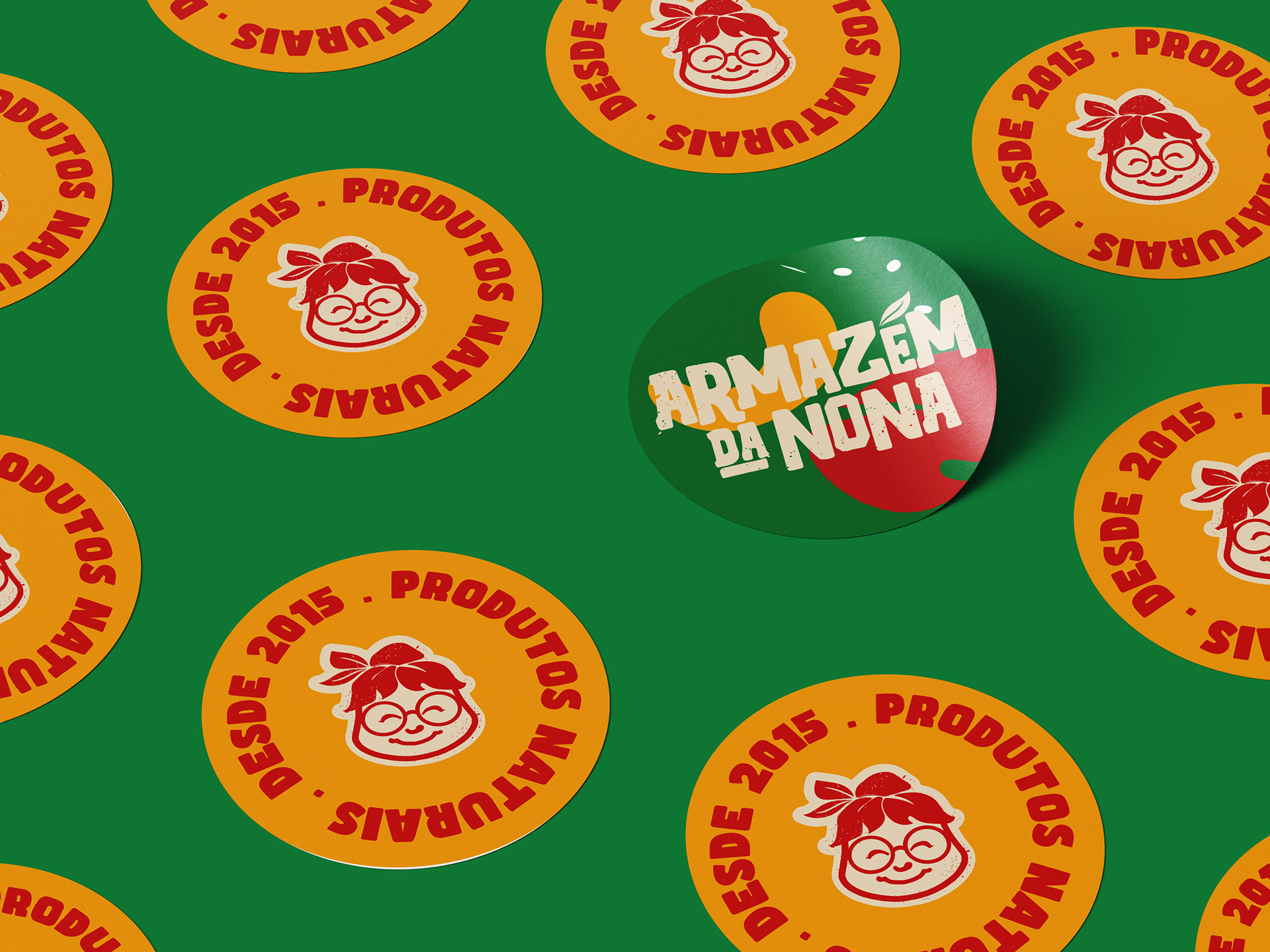
BRAND → IDENTITY → PACKAGING
WHAT I DID:
→ A brand that passes on the Nona's sympathy
Uma marca que passe a simpatia da Nona
→ A new modern look at social media
Um novo olhar moderno para as redes sociais
→ A standardization and professionalization of the products sold in the store
Uma padronização e profissionalização dos produtos vendidos na loja
Uma marca que passe a simpatia da Nona
→ A new modern look at social media
Um novo olhar moderno para as redes sociais
→ A standardization and professionalization of the products sold in the store
Uma padronização e profissionalização dos produtos vendidos na loja

moodboard with photos of the team and Nona, the person honored in the brand's naming
PROJECT OVERVIEW

EN | Armazém da Nona is a natural ingredients emporium located in Rancharia, in the interior of São Paulo. Its name pays homage to dear Nona, the grandmother of the family who runs the business with tradition and affection.
In a town of just over 29,000 inhabitants, Armazém da Nona has gained recognition for the excellence of its products and the original recipes that bring back the authentic flavor of the countryside.
With this growth came the need to professionalize the brand in order to expand its operations, serving not only the local public, but also the regional and state markets, as well as strengthening its presence in online commerce. My designer friend Tomás Paulozzi, called me in to update the brand and propose concepts for this new product.
PT | O Armazém da Nona é um empório de ingredientes naturais localizado em Rancharia, no interior de São Paulo. Seu nome homenageia a querida Nona, a avó da família que conduz o negócio com tradição e carinho.
Em uma cidade com pouco mais de 29 mil habitantes, o Armazém da Nona conquistou reconhecimento pela excelência de seus produtos e pelas receitas originais que resgatam o autêntico sabor do interior.
Com esse crescimento, surgiu a necessidade de profissionalizar a marca para expandir sua atuação, atendendo não apenas o público local, mas também o mercado regional e estadual, além de fortalecer sua presença no comércio online. Sendo assim fui chamado pelo meu amigo designer Tomás Paulozzi, para atualizar a marca e propor os conceitos desse novo produto.

Keywords → Expertise → Sympathy → Quality
Experiência → Simpatia → Qualidade
Experiência → Simpatia → Qualidade
Brand building process
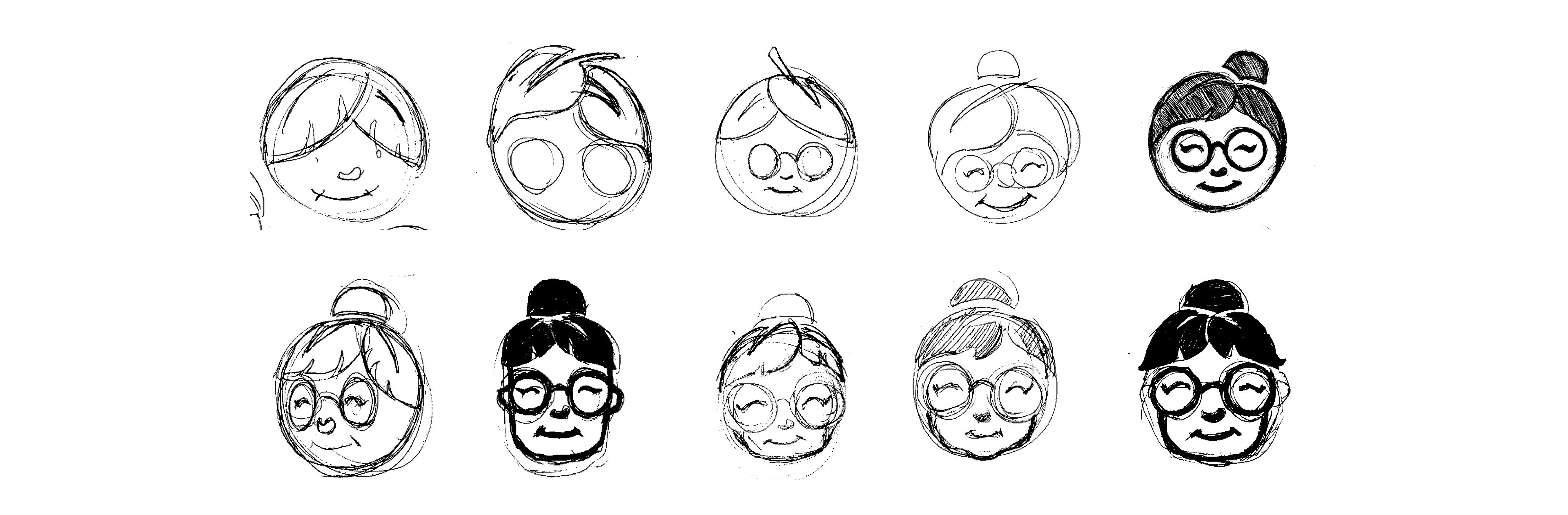
At the beginning of the project, we felt that the best way to update the brand was to keep the character that accompanies it, so we set out to rebuild this symbol.
During this initial stage of defining the symbol, I was directed by Tomás Paulozzi to achieve a better way of reading the character.
During this initial stage of defining the symbol, I was directed by Tomás Paulozzi to achieve a better way of reading the character.
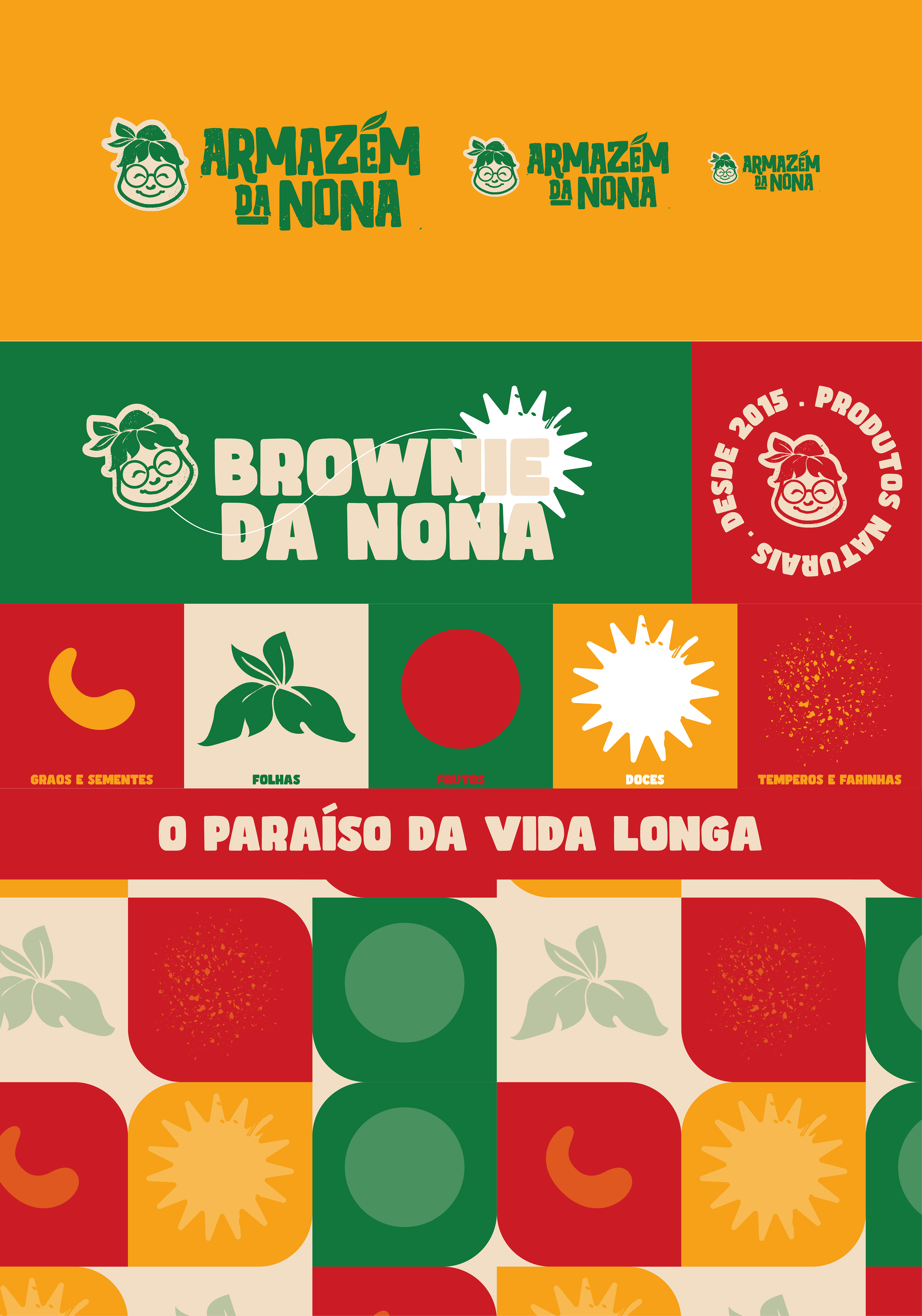
With the elements combined, we arrived at the following result:
→ LEAVES → Represents quality natural products
→ SMILE → Brings friendliness to the image, representing the quality of the service.
→ GLASSES → Represents knowledge of the family behind the establishment.
→ TEMPEROS → Adds weight to the image, creating a texture that is even more reminiscent of the natural.
→ SMILE → Brings friendliness to the image, representing the quality of the service.
→ GLASSES → Represents knowledge of the family behind the establishment.
→ TEMPEROS → Adds weight to the image, creating a texture that is even more reminiscent of the natural.
No início do projeto, sentimos que a melhor maneira de atualizar a marca era manter o personagem que a acompanha, então decidimos reconstruir esse símbolo.
Durante esse estágio inicial de definição do simbolo eu fui dirigido pelo Tomás Paulozzi para alcançar uma forma de melhor leitura do personagem.
Durante esse estágio inicial de definição do simbolo eu fui dirigido pelo Tomás Paulozzi para alcançar uma forma de melhor leitura do personagem.
Com os elementos combinados chegamos no seguinte resultado sendo:
→ FOLHAS → Representa os produtos naturais de qualidade
→ SORRISO → Traz simpatia a imagem, representando a qualidade do atendimento.
→ ÓCULOS → Representa o conhecimento da família por trás do estabelecimento.
→ TEMPEROS → Adiciona peso a imagem, criando uma textura que remete ainda mais ao natural.
→ SORRISO → Traz simpatia a imagem, representando a qualidade do atendimento.
→ ÓCULOS → Representa o conhecimento da família por trás do estabelecimento.
→ TEMPEROS → Adiciona peso a imagem, criando uma textura que remete ainda mais ao natural.

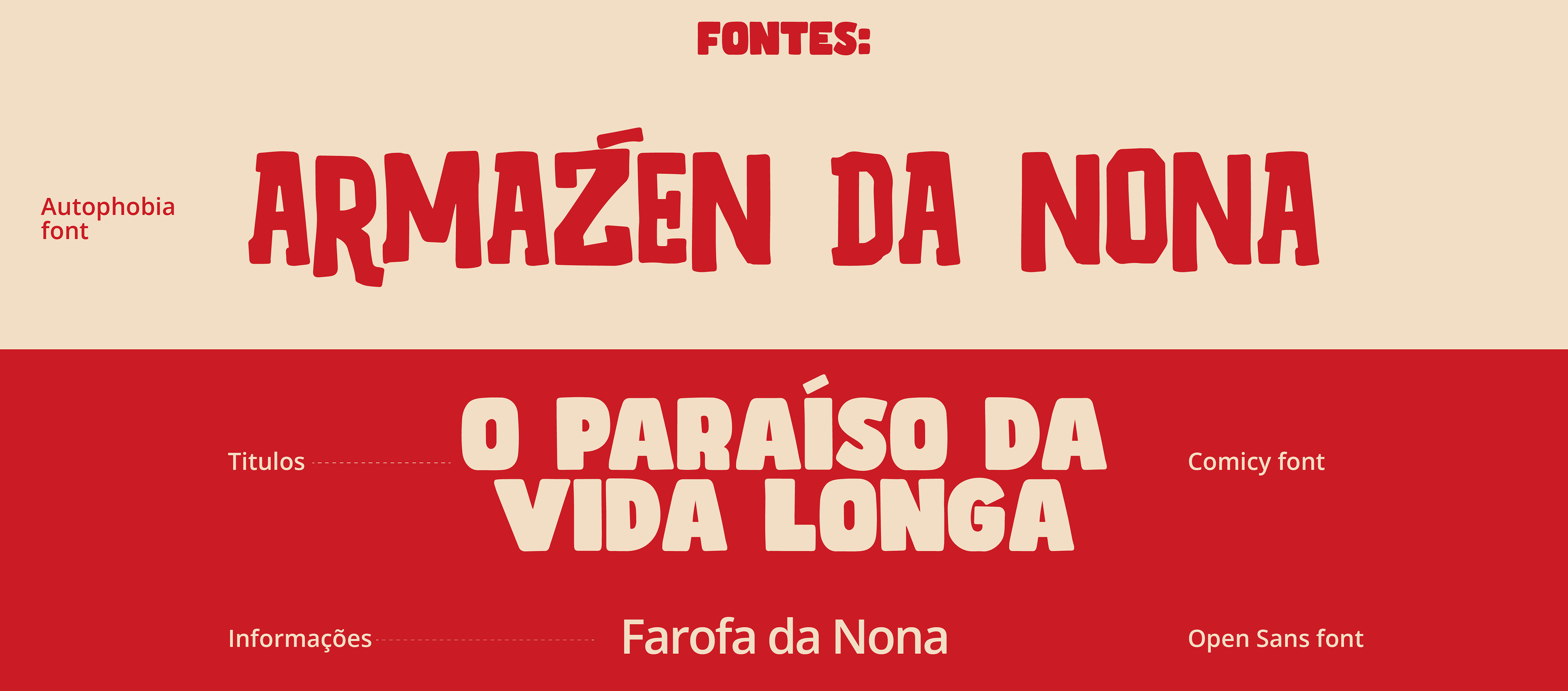
For the fonts, we tried to find something that would complement our icon, so we came up with the idea of a heavier font with handmade curves, bringing the effect of naturalness to the logo.
Para as fontes, procuramos encontrar algo que complementasse o nosso ícone, assim surgiu a ideia de uma fonte mais pesada e com curvas feitas a mão, trazendo o efeito de naturalidade para a logo.
Para as fontes, procuramos encontrar algo que complementasse o nosso ícone, assim surgiu a ideia de uma fonte mais pesada e com curvas feitas a mão, trazendo o efeito de naturalidade para a logo.
“We need a brand with strong colors that represent health, but also bring the kindness of Nona”
Developing Nona social media

Preparing food for delivery
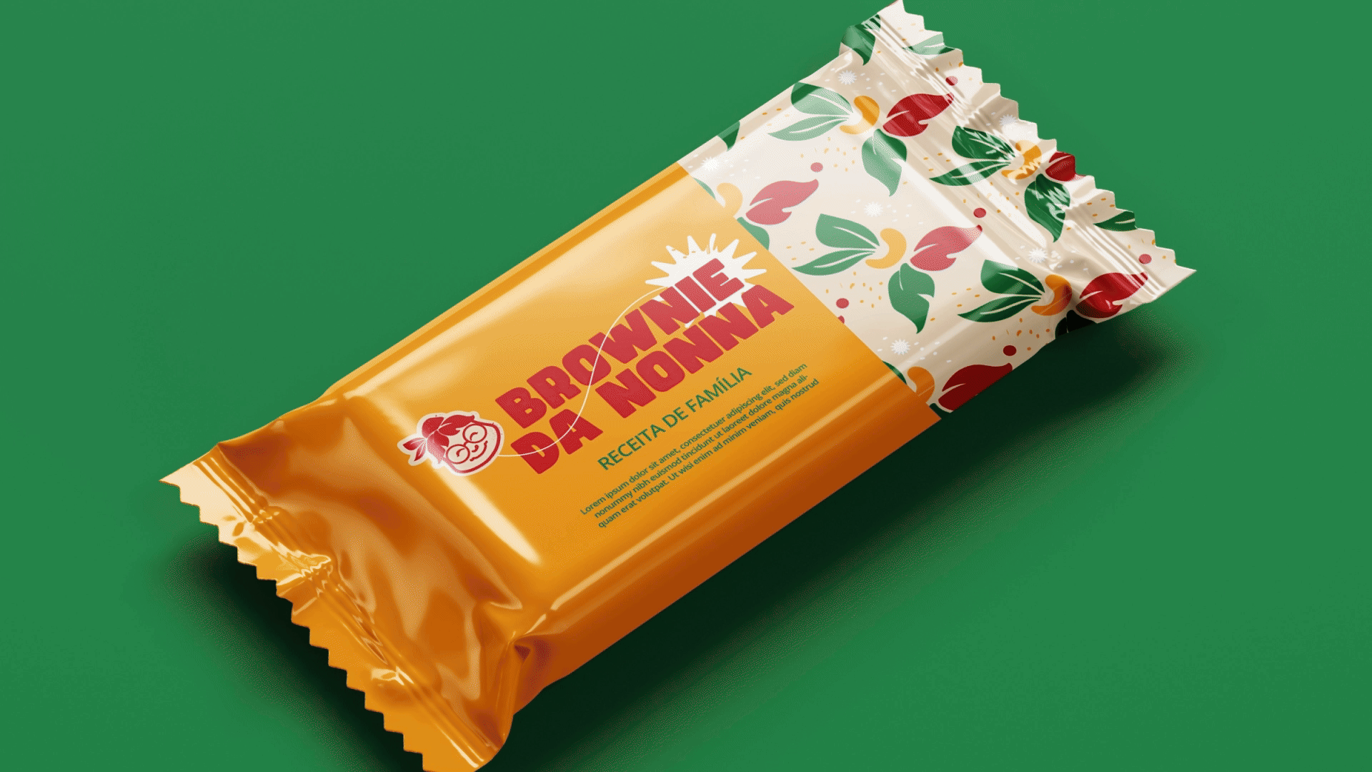
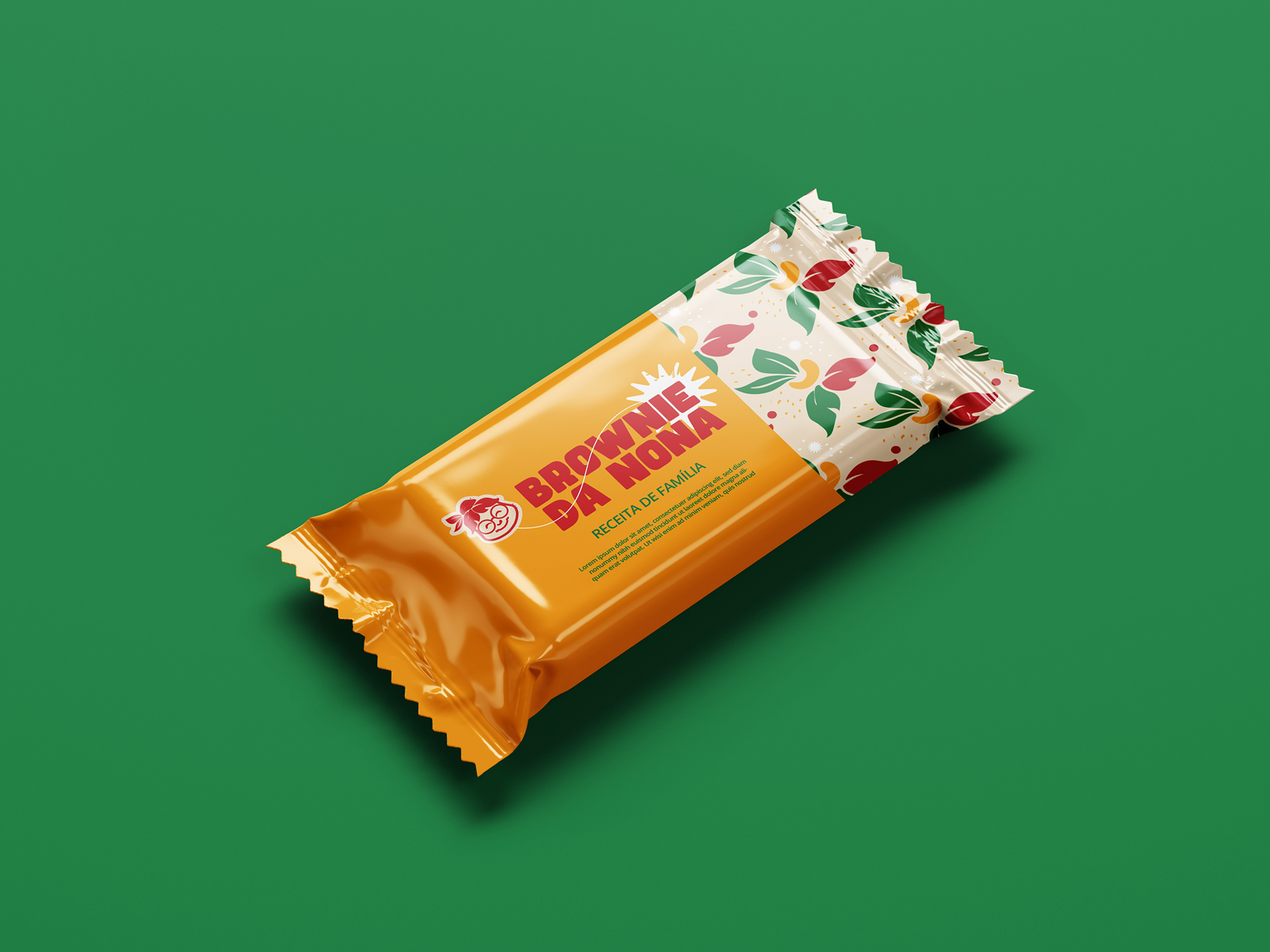
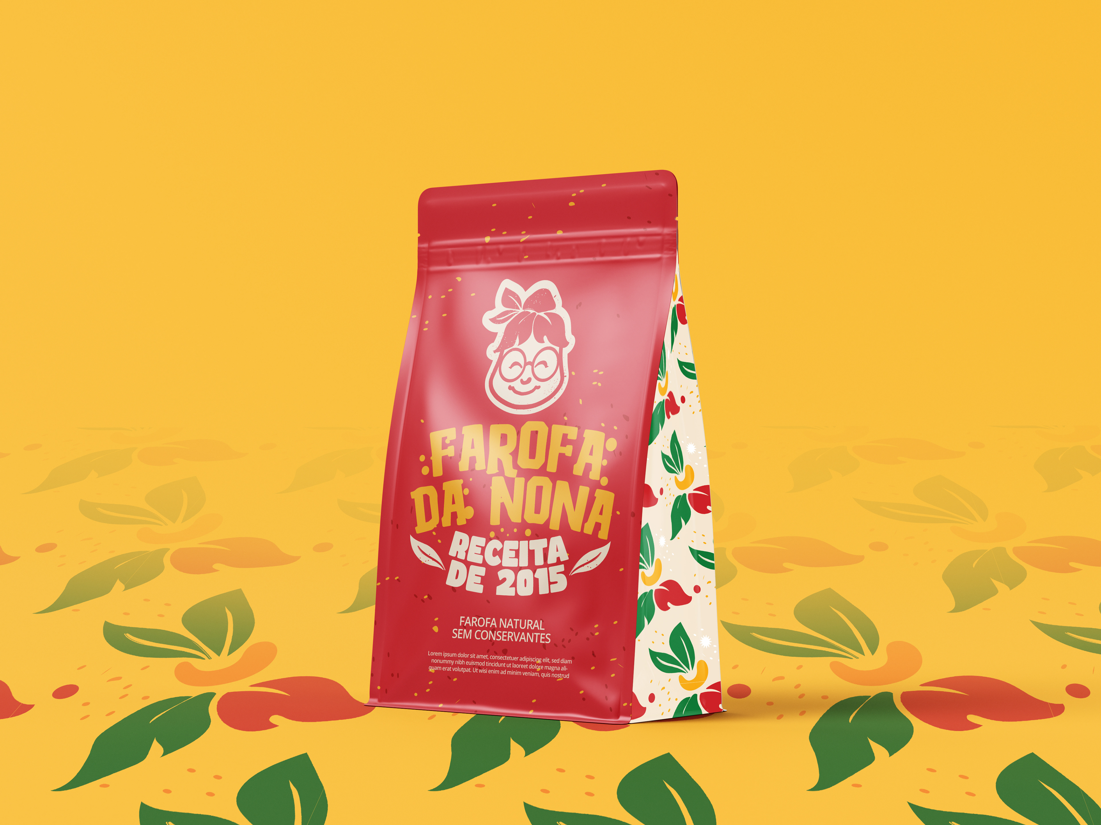
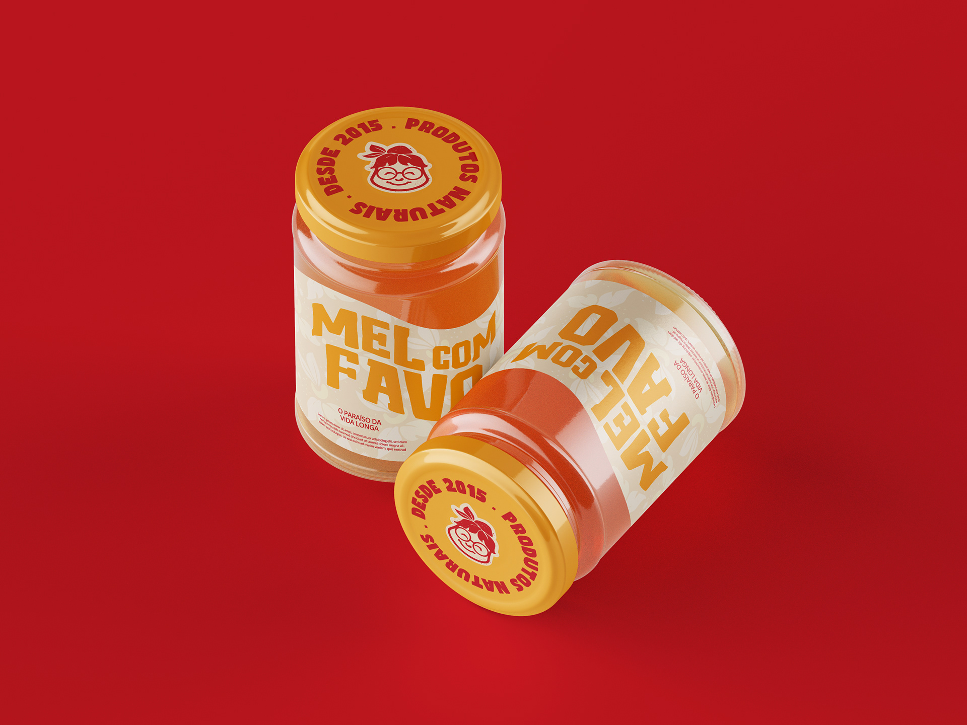
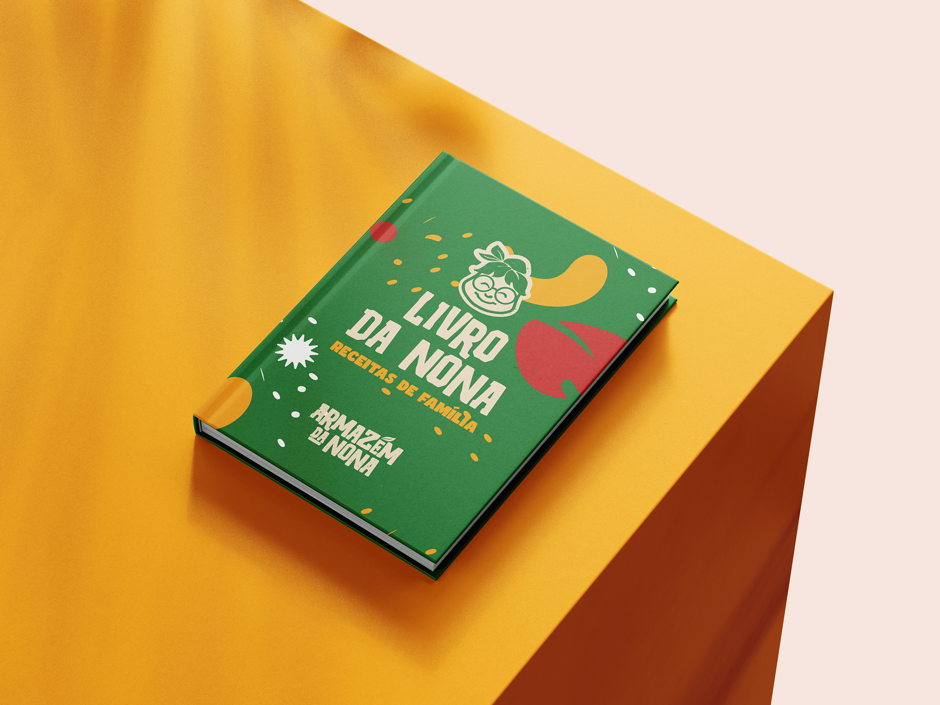
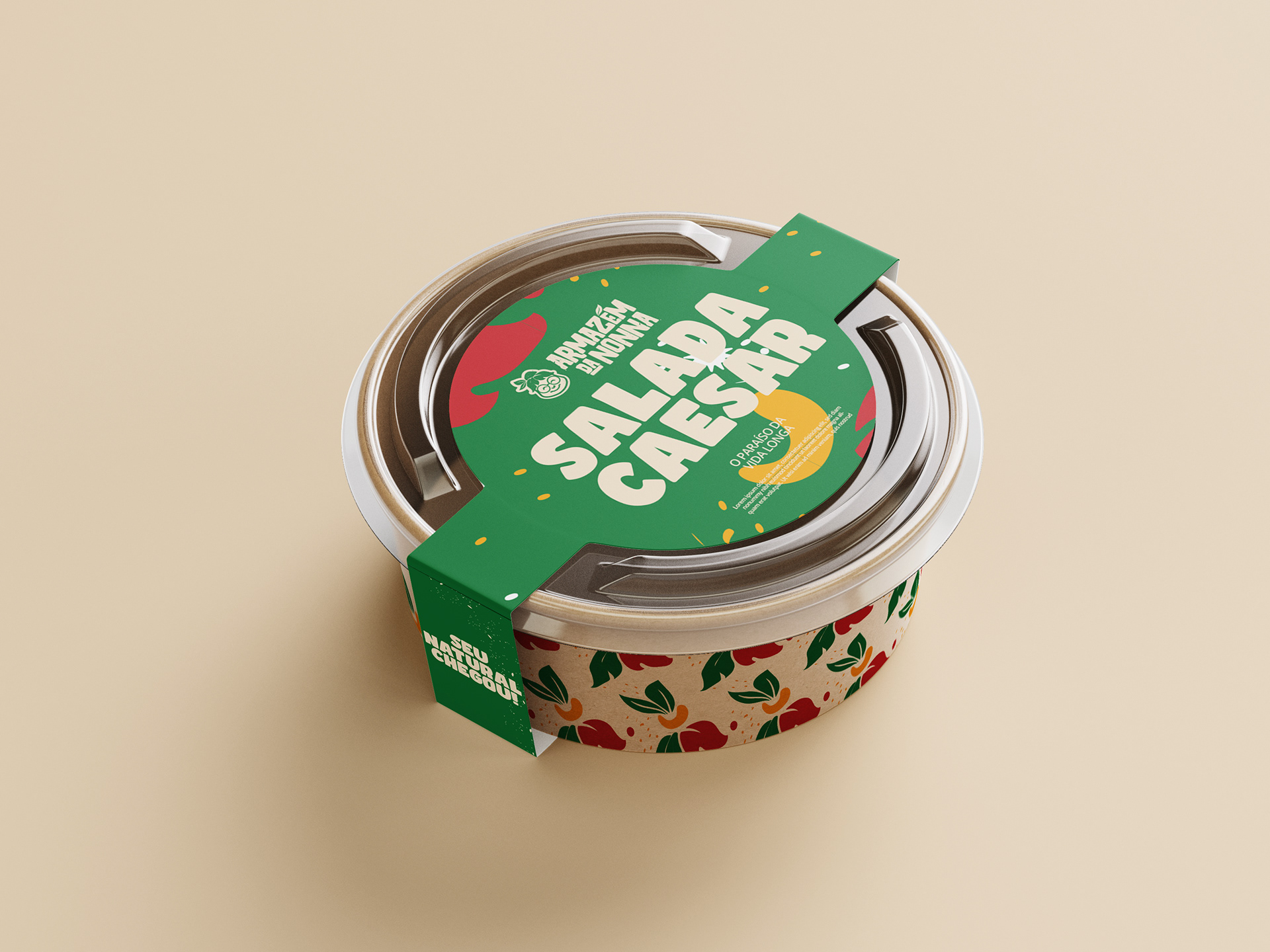
One of the key aspects in the development of the project was the creation of products for delivery and sale via apps.
The big challenge was to balance the tradition of family recipes with a modern approach, ensuring that the products were attractive both on market shelves and on social media.
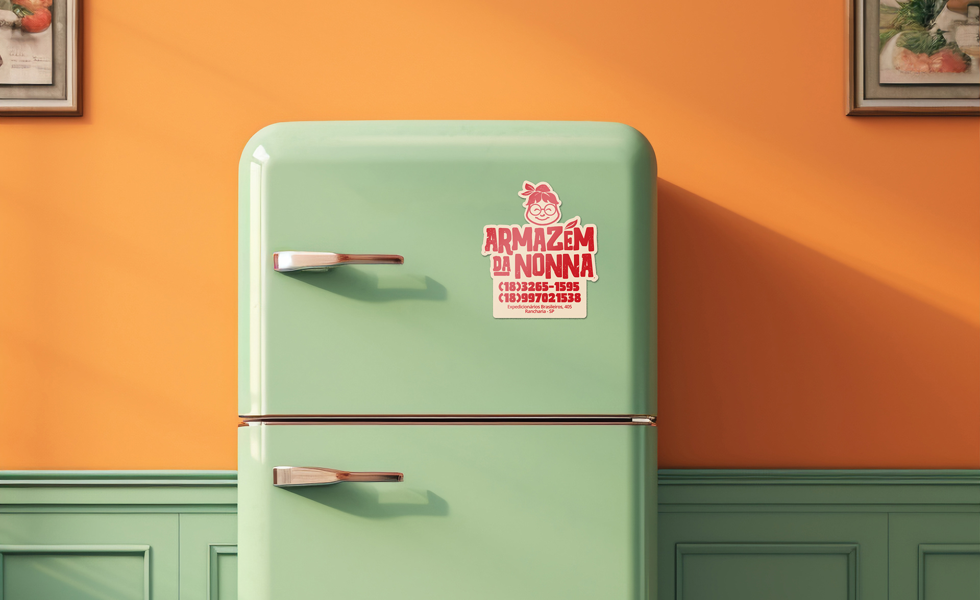
We opted for a striking and innovative design, breaking away from what is conventional for small brands. We saw an opportunity to explore shapes and symbols that conveyed flavor and authenticity, making the packaging even more irresistible.
Um dos aspectos fundamentais no desenvolvimento do projeto foi a criação dos produtos destinados ao delivery e à venda por aplicativos.
O grande desafio era equilibrar a tradição das receitas de família com uma abordagem moderna, garantindo que os produtos fossem atraentes tanto nas prateleiras dos mercados quanto nas redes sociais.
Apostamos em um design marcante e inovador, fugindo do convencional para pequenas marcas. Vimos uma oportunidade de explorar formas e símbolos que transmitissem sabor e autenticidade, tornando as embalagens ainda mais irresistíveis.
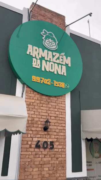
RESULTS:
→ With the project completed and approved by the client, the establishment underwent a complete makeover
Com o projeto finalizado e aprovado pelo cliente o estabelecimento passou por uma repaginada completa
→ Increased ease in developing content for instagram
Aumento na facilidade no desenvolvimento de conteúdos para o instagram
→ Increase in followers and people engaged with the brand
Aumento de seguidores e pessoas engajadas com a marca
→ Expansion of Armazém da Nona's territory of operation
Expansão do território de atuação do Armazém da Nona
→IMPLEMENTATION